Golden Age of Conservative Magazines


Owen Gildersleeve ― Illustrator
London, UK
Website
Editorial Carbon
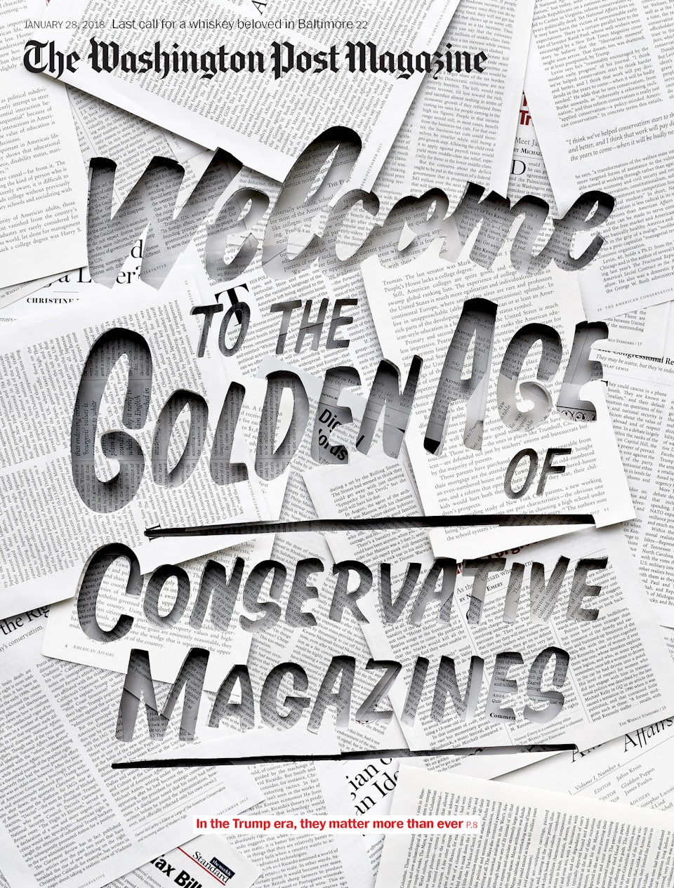
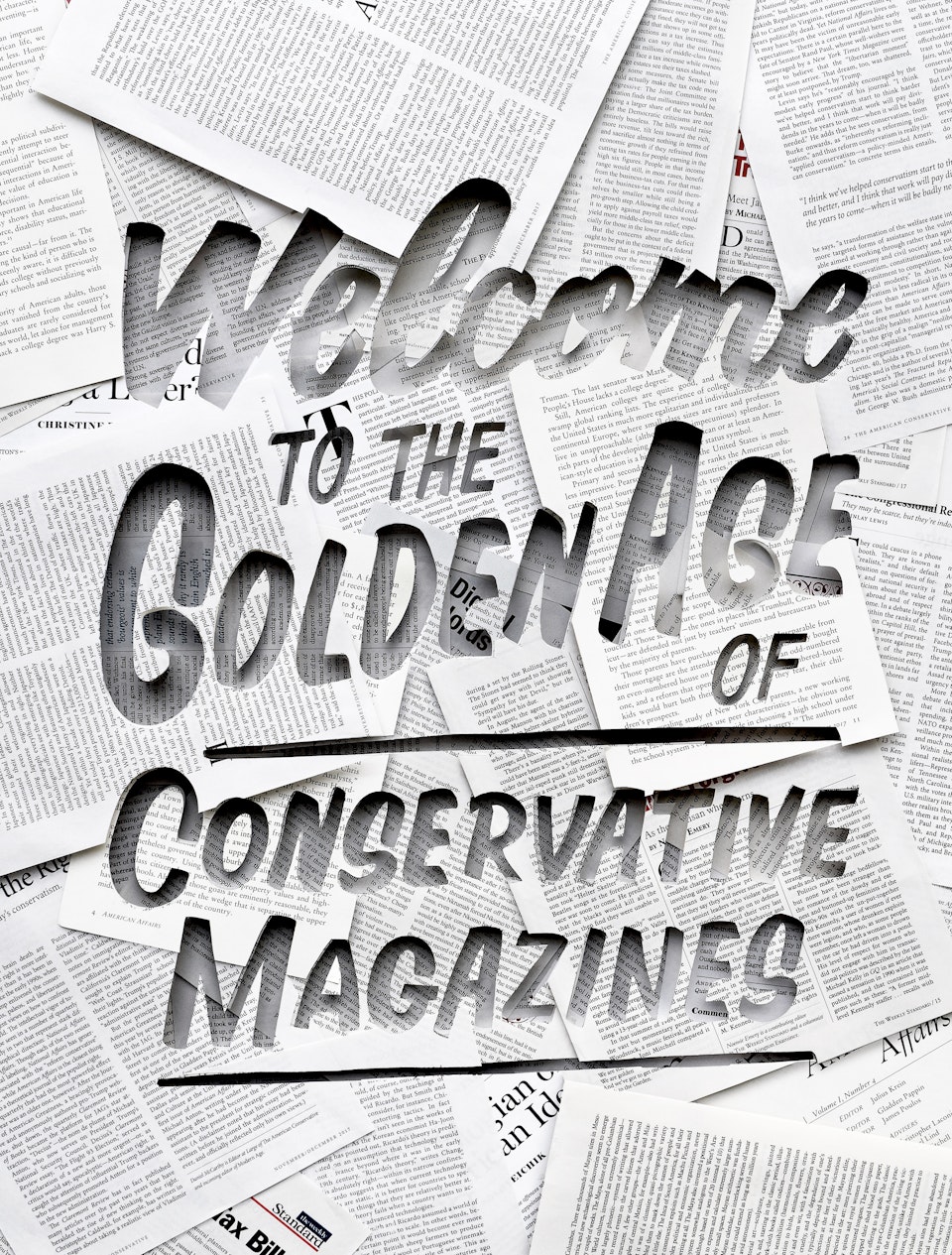
Cover artwork for The Washington Post Magazine, to accompany the feature article about 'a small group of intellectual conservative magazines who matter more than ever in this time of Trump.’
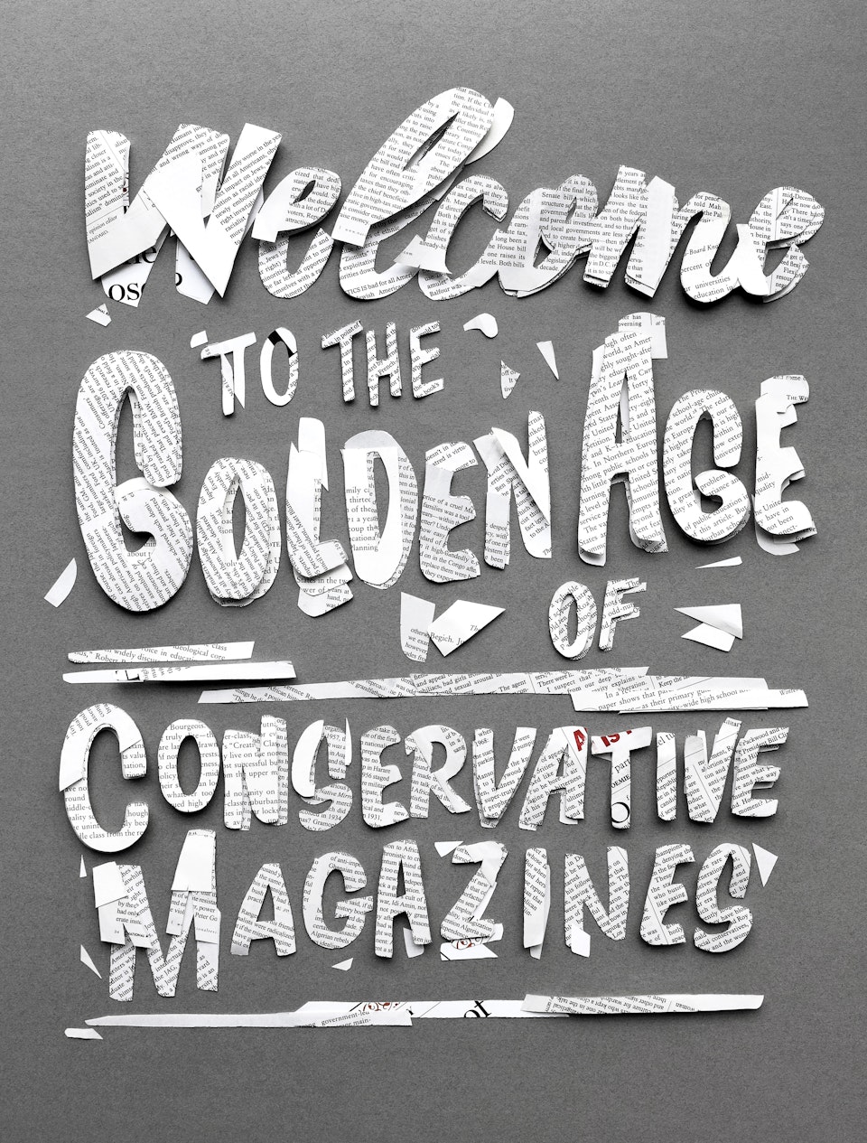
"My typography design was inspired by old sign painting, linking in with the 'Golden Age' theme of the title. The type was then hand-cut into multiple layers of conservative magazines pages, using the titles featured in the article. A range of layers were used to add an interesting visual depth, and so that when lit the shadows would help define the letterforms. The off-cuts were also used for the Opener, arranged in a loose manner with some simple layering and shot on a plain background to act as a negative of the cover."
Contributors
Christian Font
Owner
The Washington Post